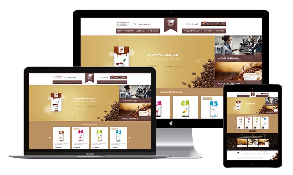
Website design:
On the basis of the topic of the site, soft coffee colours were chosen. Despite the fact that the site is rather dark, it is perfectly complemented by the light colours of the text, which is easy to read on a dark background. The site looks visually friendly, with all the important elements arranged in separate blocks. The user can immediately see what he or she needs to pay attention to.
The website is designed in three formats - separately for tablets and mobile phones. It attracts attention through a simple and user-friendly interface, a well-thought-out structure, and a clear separation of content. The user does not get lost in the great amount of information and graphics, and finds what he or she needs without any problems.